During its last Keynote on June 10, Apple finally announced artificial intelligence features intended for the general public. Beyond the practical aspect of the new features, there is an interesting fact to note concerning the way in which the firm presented things.
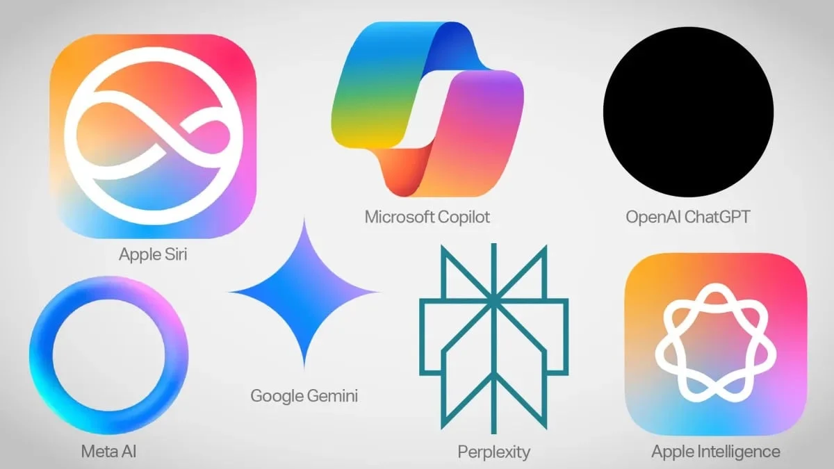
The competitors have all chosen a single logo for their tools that use artificial intelligence, but on the Apple side,we are entitled to two logos.One for Apple Intelligence in general, and a second for Siri.
Nobody really knows whythe firm chose a separate logo for Siri. Maybe she wanted to make a difference in order to show that Siri wasTHE focal point of its AI suite, and that it deserved a logo in its own right.
If we do not know the reason why Apple offers two logos, the choice of colors and shapes chosen on the other hand seems to have been chosen carefully.
A harmless appearance
According to Devin Coldewey of Techcrunch, the design chosen by Apple is made to appear innocuous, like the logos proposed by the competition:
© TechCrunch
According to him, no one knows what AI should look like, so a sort of general consensus has been established when it comes to branding:
Notice how four of the six companies use soft, pleasant colors: colors that mean nothing but are cheerful and approachable, tending toward the feminine (according to design conventions) or even childish. Soft gradients towards pink, purple and turquoise; pastels, not bright colors; four have soft, continuous shapes; Perplexity and Google have sharp edges, but the former evokes an endless book while the latter is a happy, symmetrical star with welcoming concavities.
The analysis actually seems consistent with market reality. If OpenAI has no problem with the idea of humanizing AI, this does not seem to be the position of GAFAM, whichseem to want to water it down.

i-nfo.fr - Official iPhon.fr app
By : Keleops AG

