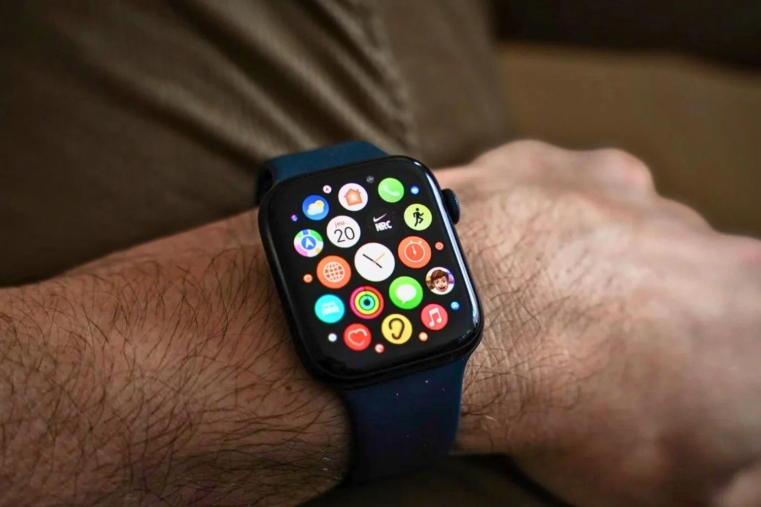
OniOS, the full list of applications is available in the home screen. In fact, all the services that you download from the App Store are automatically added to this front door which leads to unlocking the device when no task is open. The problem is that by changing the layout of this grid of 4 by 6 icons (not counting the main menu just below), you can quickly get lost.
Besides, apart from the first page, few people choose to customize the rest of this desktop equivalent on a computer. The others are therefore often less organized, and it is therefore difficult to navigate except by choosing where to display eachappafter installing it on your phone. It isone of the many differencess with what Xiaomi, Samsung or even Huawei offer.
Search, improved?
To remedy this, Apple would have imagined another scheme. In this one, the positions of the applications would not be interchangeable. They would be sorted based on several criteria, probably with alphabetical order as a bonus. This concept has already proven itself onAndroidsince its beginnings, where it is often accessible by swiping down, or even by clicking on a dedicated button in previous versions. On this OS, an additional line, at the very top of the inventory, allows moresuggest favorite appsdepending on the time frame and monitoring of your habits, which is what Cupertino will also have to do despiteits privacy policy.
This solution could also accommodate other filters, for example to classify software according to their most recent date of use or the number of notifications associated with it. We can only hope that the number of shortcuts displayed on the panel is greater than the current 24, to have a clearer overview as is for example the case on Pixels which offer rows of five. What do you think? Are you satisfied with the current presentation of the operating system of youriPhone?

i-nfo.fr - Official iPhon.fr app
By : Keleops AG